Onroot
A web platform for sharing travel experiences that enables users to both offer and receive recommendations from locals and experienced travelers.
Project Duration:
One year
Project Role(s):
Product Manager / Designer
Tivity
A productivity application designed specifically for architectural designers, focusing on efficient task management across various design phases for multiple projects running simultaneously.
Project Duration:
Four weeks
Project Role(s):
UX/UI Designer, User Researcher
Go Gallery
A mobile application that uses audio to provide users with information about art and artifacts in museums or galleries, allowing them to learn at their own pace and discretion.
Project Duration:
Four weeks
Project Role(s):
UX/UI Designer, User Researcher

Onroot
A web platform for sharing travel experiences that enables users to both offer and receive recommendations from locals and experienced travelers.
Duration:
One year
Role(s):
Product Manager / Designer
The Problem
Sharing travel experiences has never been easier in the social media age. However, not all platforms are designed for efficient and organized travel research. Some users will juggle between multiple resources, taking notes and then transferring their findings to spreadsheets. Onroot aims to simplify the travel research process by serving as a centralized hub where users can share, save and organize recommendations for future trips.


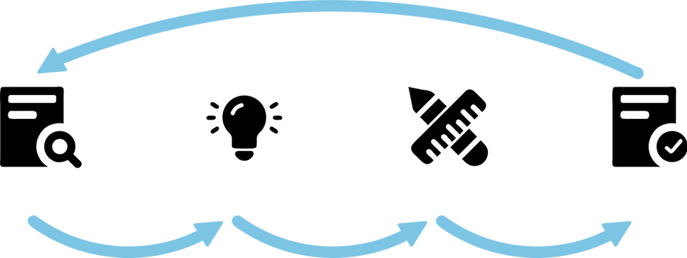
Design Process

Understand
Research
Iterate
Test
Design Process

Research
Understand
Iterate
Test
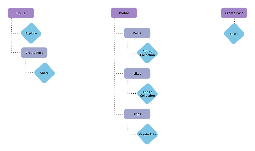
Information Architecture

Paper Wireframe
Early flaws in the design were identified, particularly regarding navigation and the inclusion of features beyond the minimum viable product. These issues were addressed during the low-fidelity prototype phase, where button functions were clearly defined.
Annotated paper wireframes facilitated the detection of these changes before the engineering phase began. Going forward, I would collaborate with software engineers to ensure that the application's key functionalities align with the minimum viable product.

User Interviews
A card sorting activity was conducted after the interviews which revealed a strong desire for:
-
Recommendations
-
Reduction in multi-application usage
-
Organizing interests / activities
Additionally, interviewees were asked about other applications they use for travel research. Trip Advisor was mentioned as a booking resource, while Yelp was mentioned to find food nearby.

User Interviews
A card sorting activity was conducted after the interviews which revealed a strong desire for:
-
Recommendations
-
Reduction in multi-application usage
-
Organizing interests / activities

Additionally, interviewees were asked about other applications they use for travel research. Trip Advisor was mentioned as a booking resource, while Yelp was mentioned to find food nearby.
Competitive Audit
During the competitive audit, I evaluated three travel-related companies. My comparisons revealed that user-generated content would be the primary focus of the application's functionality. Additionally, all three companies offered deals or booking services.

Despite the emphasis on user-driven content, each company found ways to differentiate itself from the others. For example, TripAdvisor allows users to contribute by posting reviews about destinations, while Wanderlog primarily relies on Google reviews. On the other hand, Out of Office focuses on content creators, allowing users to follow each other for inspiration and tips. Onroot looks to become the next iteration of these travel-related companies by incorporating some of the shared commonalities while proposing additional unique features.
The user journey is inspired by industry adjacent applications such as Yelp and Pinterest. Yelp offers detailed search options with ease, while Pinterest keeps users engaged through visual discovery. Combining elements from both platforms would create an effective travel research platform.

Competitive Audit
During the competitive audit, I evaluated three travel-related companies. My comparisons revealed that user-generated content would be the primary focus of the application's functionality. Additionally, all three companies offered deals or booking services.

Despite the emphasis on user-driven content, each company found ways to differentiate itself from the others. For example, TripAdvisor allows users to contribute by posting reviews about destinations, while Wanderlog primarily relies on Google reviews. On the other hand, Out of Office focuses on content creators, allowing users to follow each other for inspiration and tips. Onroot looks to become the next iteration of these travel-related companies by incorporating some of the shared commonalities while proposing additional unique features.

The user journey is inspired by industry adjacent applications such as Yelp and Pinterest. Yelp offers detailed search options with ease, while Pinterest keeps users engaged through visual discovery. Combining elements from both platforms would create an effective travel research platform.
Information Architecture

Paper Wireframe
Early flaws in the design were identified, particularly regarding navigation and the inclusion of features beyond the minimum viable product. These issues were addressed during the low-fidelity prototype phase, where button functions were clearly defined.
Annotated paper wireframes facilitated the detection of these changes before the engineering phase began. Going forward, I would collaborate with software engineers to ensure that the application's key functionalities align with the minimum viable product.

Highlights

This input fill form is intended to provide the fields where critical travel information can be shared. Users can provide location, hours, cost, general information and eye catching photos & videos.

Users can review their posts collectively in the Posts section, offering a comprehensive view of their content. Additionally, they can create collections based on posts from similar areas or regions. This feature enhances the clarity of a user’s profile for others to explore.

A modal will appear when viewing a post which provides the basic and detailed information of the travel recommendation. A user can also access another user’s profile from here to view other content they have shared.

Likes can be efficiently organized for future trips. A modal will appear, guiding the user to select the relevant trip or create a new one directly from there.

When a user views their upcoming trip, they are given the ability to drag individual posts into a daily calendar for further detailed planning. This planning dashboard includes a task list and a map identifying where saved posts are located in relation to each other.

In the Trips section, users can see their upcoming trips. Saved posts related to a trip can be accessed by selecting the corresponding tab here. Moreover, users can create a new trip by providing a title and dates through a modal prompt.
Conclusion
My experience as the principal designer and manager for a startup was incredibly fulfilling. It underscored the importance of grasping product priorities to allocate attention to the right pain points effectively.
Key lessons learned from this project:
-
Prioritize the MVP: It's easy to become sidetracked by adding extra features, but focusing on the minimum viable product ensures that core pain points are addressed.
-
Ensure design clarity: Engineers will follow your design closely, so it's crucial to ensure that it aligns with team standards before implementation.
-
Take your time initially: Investing more time in the early stages allows you to thoroughly address pain points and establish a clear design language, ultimately leading to faster progress.
Highlights

This input fill form is intended to provide the fields where critical travel information can be shared. Users can provide location, hours, cost, general information and eye catching photos & videos.

A modal will appear when viewing a post which provides the basic and detailed information of the travel recommendation. A user can also access another user’s profile from here to view other content they have shared.

When a user views their upcoming trip, they are given the ability to drag individual posts into a daily calendar for further detailed planning. This planning dashboard includes a task list and a map identifying where saved posts are located in relation to each other.

Users can review their posts collectively in the Posts section, offering a comprehensive view of their content. Additionally, they can create collections based on posts from similar areas or regions. This feature enhances the clarity of a user’s profile for others to explore.

Likes can be efficiently organized for future trips. A modal will appear, guiding the user to select the relevant trip or create a new one directly from there.

In the Trips section, users can see their upcoming trips. Saved posts related to a trip can be accessed by selecting the corresponding tab here. Moreover, users can create a new trip by providing a title and dates through a modal prompt.
Conclusion
My experience as the principal designer and manager for a startup was incredibly fulfilling. It underscored the importance of grasping product priorities to allocate attention to the right pain points effectively.
Key lessons learned from this project:
-
Prioritize the MVP: It's easy to become sidetracked by adding extra features, but focusing on the minimum viable product ensures that core pain points are addressed.
-
Ensure design clarity: Engineers will follow your design closely, so it's crucial to ensure that it aligns with team standards before implementation.
-
Take your time initially: Investing more time in the early stages allows you to thoroughly address pain points and establish a clear design language, ultimately leading to faster progress.